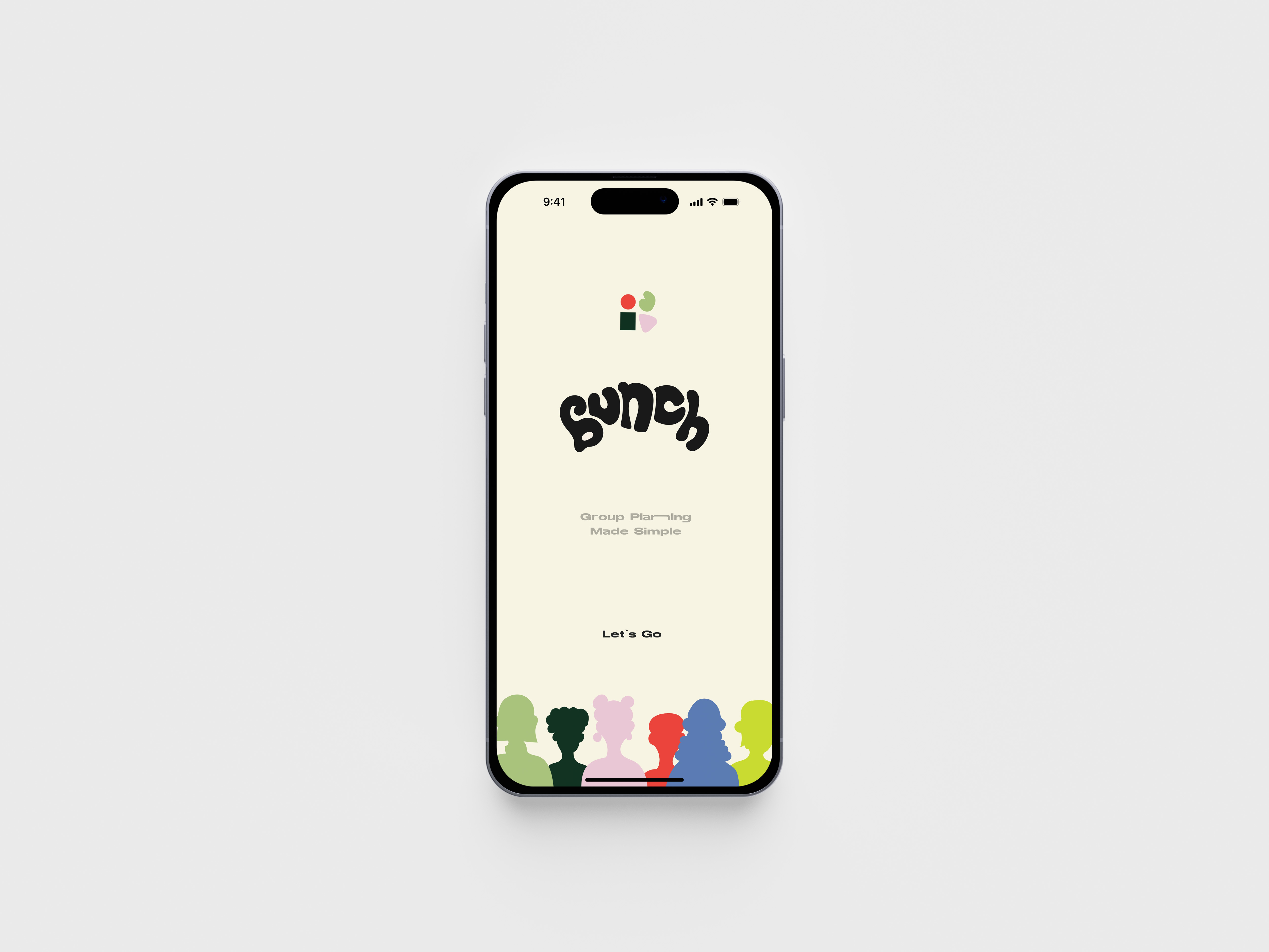
BUNCH
-2022
Course: FA22 User Experience CDGD-412Professor: Christine O’Dell
Team: Olivia Norris, Hannah Wang, Katie Li


Overview
Bunch is one of the UX projects from the User Experience course at Pratt Institute. We observe that people are stressed about feeling socially disconnected and drained regardless of feeling bored. In addition, people having difficulties managing relationships, health concerns, and overall planning have become an issue because of COVID-19.Social Harmony ︎︎︎ Seamless Activity Planning ︎︎︎ Inspiration ︎︎︎ Organization ︎︎︎ Connection
Our concept is to create an application that allows people to manage their routines better, seek inspiration, and easily organize social gatherings concerning the needs and preferences of friends and family.
Users
Bunch is for 18-40-year-old users who seek to spruce up their routines with new hobbies and activity suggestions, spending frequent and efficient quality time with loved ones, and setting organizational standards to meet self-care and bucket list goals.
We want our goal audience to feel inspired, connected, and relieved after interaction with Bunch.
Our concept is to create an application that allows people to manage their routines better, seek inspiration, and easily organize social gatherings concerning the needs and preferences of friends and family.
Users
Bunch is for 18-40-year-old users who seek to spruce up their routines with new hobbies and activity suggestions, spending frequent and efficient quality time with loved ones, and setting organizational standards to meet self-care and bucket list goals.We want our goal audience to feel inspired, connected, and relieved after interaction with Bunch.
Competitor Analysis
We wanted to find out what kind of applications outside people frequent interaction with, making plans, scheduling, networking and resourcing activities, things to do, and where people go to get inspired or feel connected. Therefore we chose TikTok and BeReal. for our competitor analysis.BeReal.
Every day at a different time, users will notify simultaneously to capture and share a photo within two minutes.
It is a new and unique way to discover who your friends are in their daily life.
- Focused on ONE idea: Being real
- Simply use black and white colors for the UI design
- Accessible to users who are familiar with Snapchat & Instagram
- Targeted college student
- No ads
TikTok
A social networking site where users can make, share, and find short videos. The software allows young people to express themselves through lip-syncing, humor, dancing, and singing. Users may also make films and share them with their social networks
-
Quick response/feedback to like or disliked content
- Accessible location of desired content, search users and search prompts
- Aesthetic and nonchaotic viewing
- A desirable amount of stimulation
Journey Map Diagram
Constructed to identify the necessary and supposed activity paths that users would take in their navigation of the app.
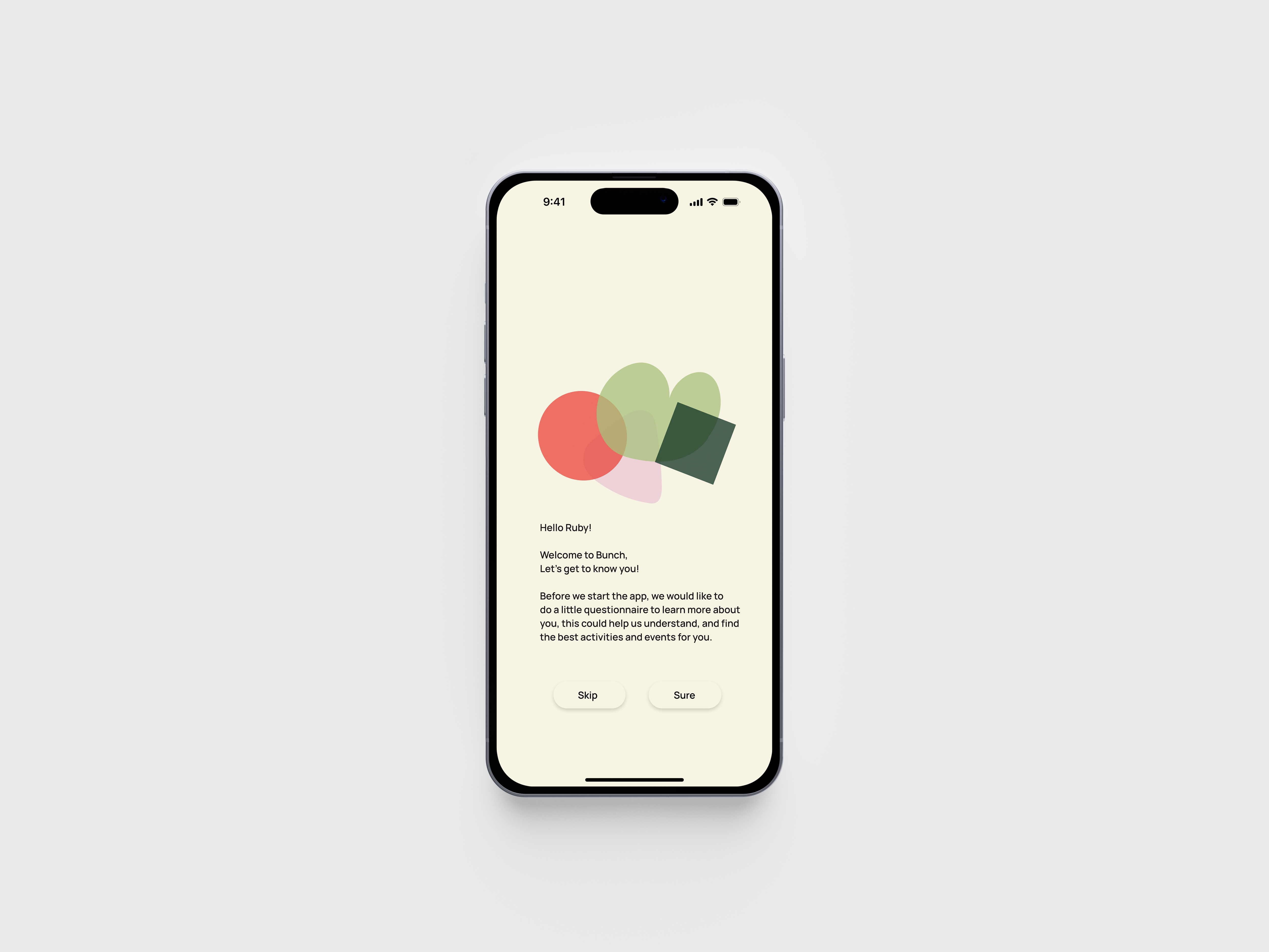
Persona

Scenarios
Final Scenario EX: 1
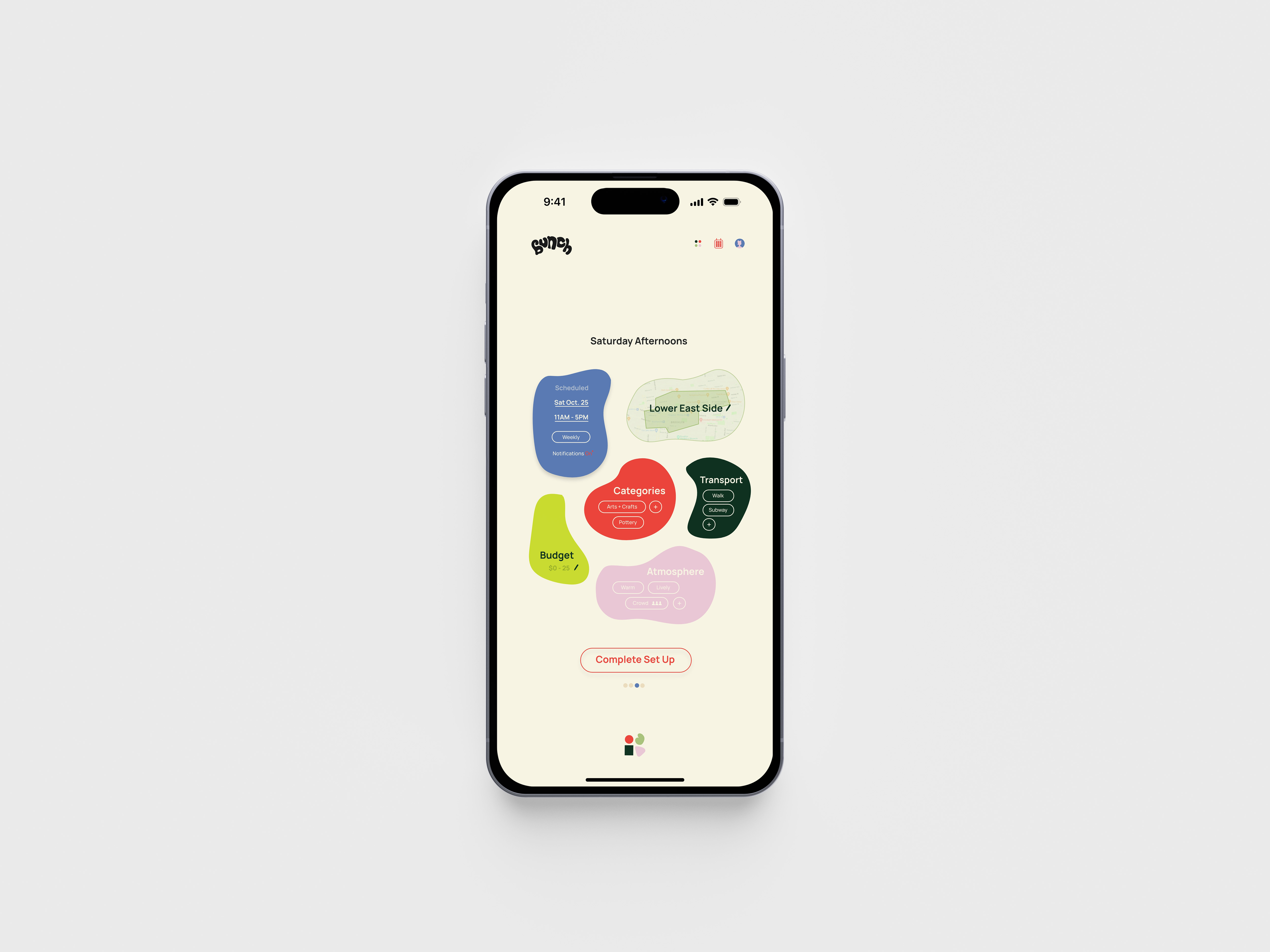
Every week, Ruby has some free time on Saturday afternoons and has decided that she wants to use that time to explore new parts of the city and visit more art museums and galleries. As she is also hoping to get into pottery, she thinks that using friday afternoons to check out sculptures in galleries and museums will inspire her. She knows that after a busy week however, that she will not have time to organize or search for a new gallery every week.
Ruby needs to set a reminder tailored to this specific activity profile so that she gets a new gallery or museum suggestion every week.
Final Scenario EX: 2
Ruby has been wanting to try pottery for the longest time, but she’s been putting it off due to all the planning required. She’s finished with a project at work, which means she’d be stress free this coming Sunday (Dec 4th) and is planning to use the afternoon to explore this newfound interest. She’s hoping to find some recommendations for pottery lessons in NYC and start at around 3pm so that after class, she’d be able to grab something to eat in the area.
Requirements
for Interaction with the App- Activity Preferences + Filters (price, location etc.) + Friend list *Connect Users
- Make Groups of People *Friend Groups
- Feed : Posting Updates,
- Routines New Activity/New Group Activity
- Discover Feed
- Interactive Calender
- Networking Options Themed Suggestions, Collections
Key Elements Thinking for Design
- Profiles
Personalization
-
Invitations and Grouping
-
Public Discover Feed
-
Schedule/Calendar
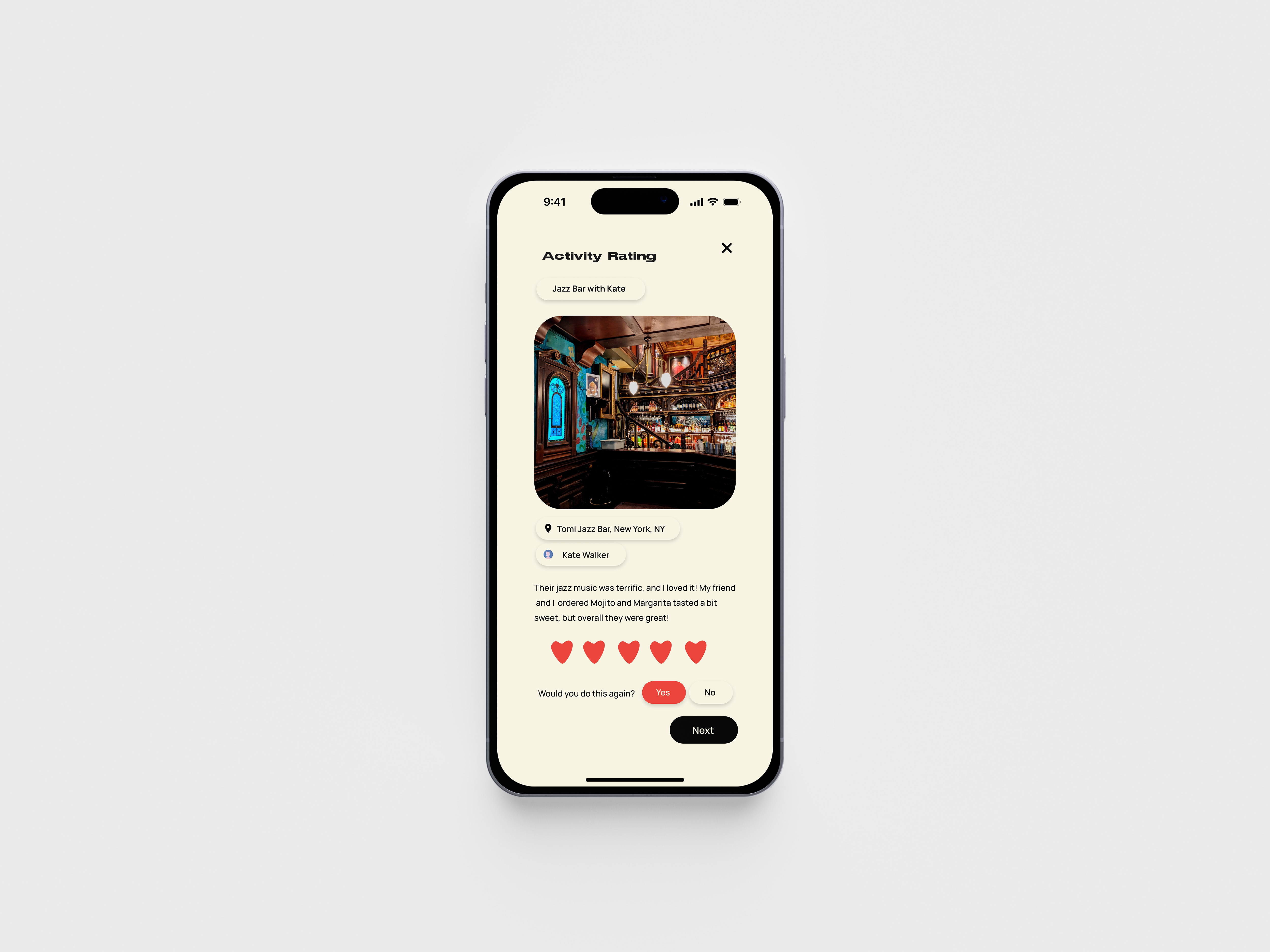
Activity
- Ratings and Reviews

System Map
Extensive view of all user pathways within the application, all button options and all possible points of interaction.
Flow Diagrams
based on Requirements1. Set Up Activity Prefernces

2. Create New Activity
3. Create New Group
4. Rating Experiences
5. Scheduling from Discovery Feed
Wireframe
The physical layout of task flows, beginning to develop button and framing and spacial relationships between elements — benefits to different wireframing forms allowed for easy content manipulation in terms of revision and group comparison.Rating Experience
Posting preference or status updates to group event

Visual Identity System
We are determined to create a consistent and engaging visual identity complete with fonts, color palettes, graphic illustrations, identifier brand' motifs,' and concepts for micro-interactions.
User Testing
Our team could observe, evaluate, and quantify the user experience of a product through user testing.We started the study with the consent form tailored to Bunch guidelines and completed by all 6 participants involved in the user study. In addition, the script for the interview includes an introduction to the project, the privacy conditions of the research, and task descriptions to guide the testing sessions. The user study questionnaire measured usability, functionality, and consumer interaction with the Bunch app prototype.
Get To Know The Users Habits
-
How many days a week do you go out?
-
How many days a week do you hangout with friends?
-
Do you use apps to find activity inspiration / things to do ?
-
What apps do you use? / prefer?
- When/where do you use these apps?
Prototype Feedback From The Users
- Make icons stand out, easily
recognizable
-
Continuity in button design
- Make editable elements more obvious areas of intended interaction
- Use more ‘pencil icon’ for editing
General User Data
Most users go out twice a week and use more than one app to find inspiration for activities and reported feeling overwhelmed when trying to accommodate a group of people or a large group of friends.
Feedback Analysis & Key Revisions
The main errors with the user study prototype were in double-clicking functionality, missing interaction queues, too small text sizes, button size and format inconsistencies, button hierarchy, and clarity of icons.
Positive Feedback
Most feedback noted specific functions and praised fun, engaging design emphasizing sound effects, colors, and organic shapes—no good or bad reports on typography.
Questionnaire Feedback
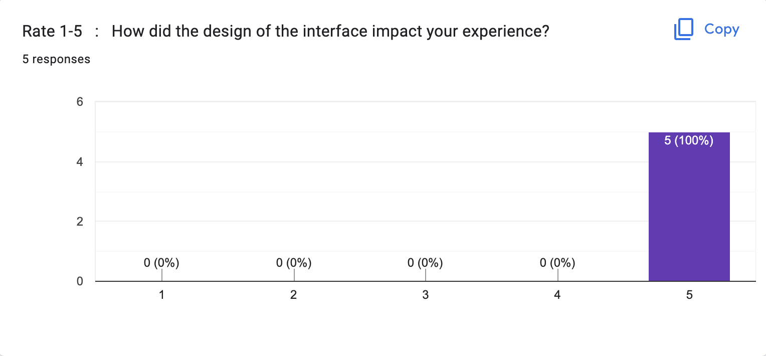
Most participants (5/6) reported that the navigation, functions, impact of the interface, and specific 'my stuff' dashboard were engaging and clear for the most part. However, 1/6 participants noted slight trouble with general navigation and the 'my stuff' dashboard. Written notes within the survey yielded trouble recognizing buttons as buttons and some clarity with transitions.
What are some areas of improvement that you noticed while interacting?
What would make this app seamless?
“transitions(?)”
“The only suggestion I have would be to make some of the editable fields more obvious, like the titles.”
“Maybe make some of the clickable icons more recognizable as a button?”
“I'd say there were a couple of spots where I'd expect there to be buttons like there were on other pages. Adding that would make it more seamless.”
“One minor thing I'd mention is for example, when renaming a group activity, a little indicator that the title is editable would be nice like a pencil icon or something”


Reflection
The prospective development of Bunch as an application prototype for the iPhone has sought to encourage consumer awareness around the self, environment, and daily routine. It is helping users to better manage their social and independent activity-based goals in a mid-post-COVID-19 climate.Bunch was a project that introduced us to the inner workings of the multi-layered app design process and consideration of the entire user experience within primarily digital space and social media. Interviewing and feedback are essential parts of our research. Thank you to our participant users, professor, and teammates being part of the project with me. I am grateful to work with each on the Bunch project and learned a lot from each role.
If there was additional time
-
Creation of different user personas and task models, including experience-based journey maps
-
More study is needed for a better event planning/ scheduling system
- Additional iterations and test phases
Video of Final Prototype
Music: luv letter💟 Prod. ponydisplay
https://youtu.be/1y-FAdTgqmE